IZZI brand design
What is IZZI?
It is an educational software suite which consists of an authoring tool and a distribution app. The authoring tool is an online application in which content creators, editors, proofreaders and other professionals can work on creating and presenting educational material, while our distribution app is a webpage-like environment where pupils can access the created content.
What is Profil Klett?
We are a multinational corporation focused on creating educational materials for all educational stages. Although our primary focus is still on printed materials, we have started to incline towards digital content as well. As publishers, we tried using various digital tools and principles to create our content, but couldn’t settle on just one that would meet all our needs. This is why we set out to create our tailored tool, made by publishers for publishers. Just the thought of creating an amazing tool that others in the industry could use gave us all the wind we needed in our sails!
Made by publishers for publishers.
Where does our brand name come from?
First, let us answer some other questions. Who are our users? Where are they located? What language do they speak? How tech savvy are they? Do they suffer from any physical or intellectual impairments?
Our users are teachers and content creators focusing on education – they are the ones who don’t settle for the status quo but focus on continuous innovation and improvement in education. Among our users, there are also young minds who refuse to yield to the static, the linear, the unilateral – these pupils love experimenting, playing and exploring, and perceive our activities as fun and rewarding.
Our users can be anywhere – in a classroom, in a queue, on commute, at home… All they need are their smartphones, tablets, computers or smart board screens.
They can speak their native languages.
Since we wanted our app solution to be used even with preschoolers, it was crucial to make our interfaces as simple and as intuitive as possible. This means that even the youngest of students can use it to learn and play without missing out on any of its features!
We aimed at making our app as inclusive as possible – we wanted to create a platform which would promote equal opportunities, help our users bridge the gaps caused by their impairments and allow them to thrive.
Having all this in mind, we toyed with various names until we finally settled on IZZI, an acronym formed from the initial letters of the words that we hold very dear – interaktivno (interactive), zanimljivo (interesting), zabavno (fun) and inkluzivno (inclusive). As you may have noticed, it also reads as the English word ‘easy’ (ˈiːzɪ). We found this happenstance to be very satisfying and profoundly inspirational.

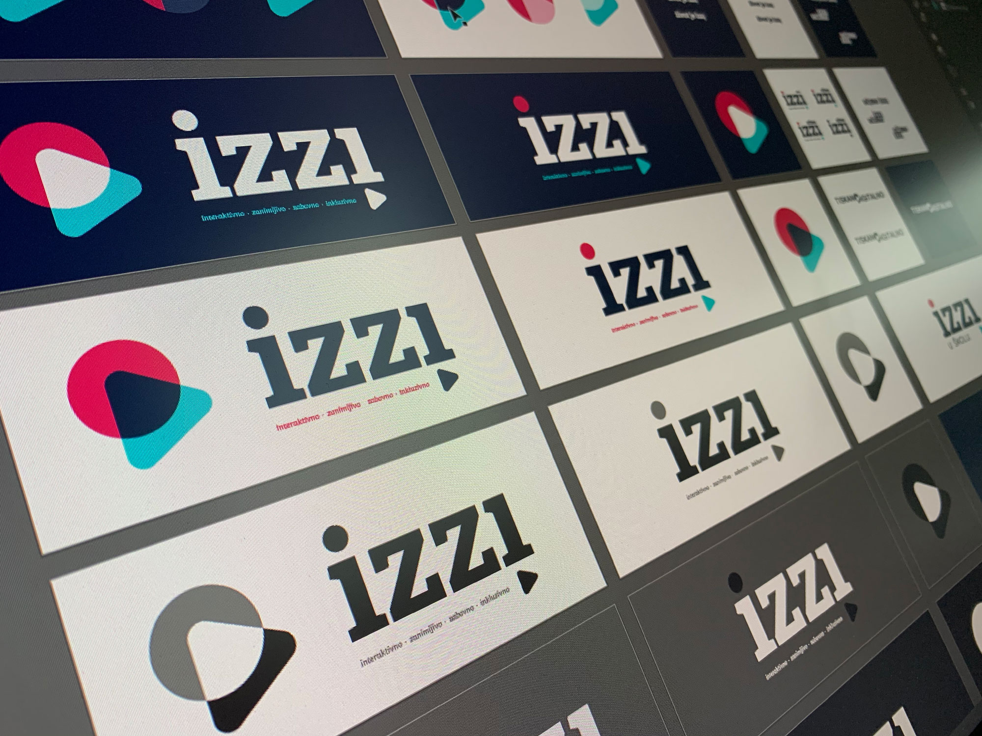
What about the logo?
When thinking about our starting point, our market, our plans for the future, and especially our blended learning principle (i.e. the combination of printed and digital educational materials), we thought the brand should represent the symbiotic relationship between the static and the interactive, the present and the future. This is why it seemed natural to create a two-part logo melted into one seal – the first part standing for our history and expertise (creating and printing educational materials), and the second one representing our plans and visions for the future (digital, interactive, non-linear learning).

IZZI sign as seen on a dark and light backgrouds.
What is print?
Essentially, it’s a raster of printed dots on a surface. A dot is as basic as it can be. It can be a part of anything – an image, a letter, a number. Outside of the printing technique and industry, a dot is a point of origin, a starting point, a basic element. It also represents a centrifugal shape going round and round, learning, upgrading, re-iterating and improving itself.
What is digital?
Coming from the Latin word digitus, which means finger, it’s everything that can be touched and interacted with… played with, if you will. ˝How should we represent (inter)action?˝, we asked ourselves. Suddenly, an arrow came to mind – it shows purpose, action and direction. It shows vector and trajectory. Let’s minimise it, we thought, let’s use a triangle. It is still an arrow and it is pointing in the right direction – towards the future. And it stands for the multimedia play icon as well, how neat is that? This juxtaposition of one-dimensional, traditional, scientific, encyclopaedic on the one hand and multipurpose, actionable, futuristic on the other proved to be a highly interdisciplinary symbiosis. We couldn’t love it more.

We have a name and we have a seal. So, how do we combine them to create our brand?
![]()
Let’s take one more look at the circle and the triangle. The former represents a starting point, whereas the latter represents a vector directed to the future… Alpha and Omega, anyone? Wanting to emphasize inclusivity and diversity, we flipped our last letter i. Yes, now it’s upside down. Yes, it’s different. But it’s still a part of our ecosystem. It still gets all the recognition. And it also builds massively on originality and memorability. What was once viewed as the weakest link, now became our strongest and boldest purpose. Start smart, learn unobtrusively, and the future is yours!
Learn the easy way.
Learn with IZZI.